Landing pages and conversion optimization are some of the

trendiest topics regarding growth hacking and customer acquisition / activation. There are tons of really great posts talking about the ‘anatomy of a converting landing page’, and articles breaking down the optimization process, but I haven’t read many posts that actually prepare you for the full process, from a blank page to a first good-enough version to start with.
In the last 3 months I helped to create over 20 landing pages (for 7 different companies) from an idea and recognition of the user’s need to finalizing the design and planning the first batch of A/B testing.
The interesting things about accompanying these companies in the process was that they are all very well read and highly engaged in the conversation around landing pages, copywriting and optimization but were surprised of how the process actually looks like when starting from scratch.
One of the disadvantages of writing “how to’s” is that the process always looks very clean and intuitive, while in real life, it’s more of a hard day to day work, and less about getting immediate significant results.
There are some amazing articles out there on creating great landing pages. From how to write eye catching headlines, improving your copy, using powerful keywords and creating a compelling CTA, but not many are talking about starting from a blank page.
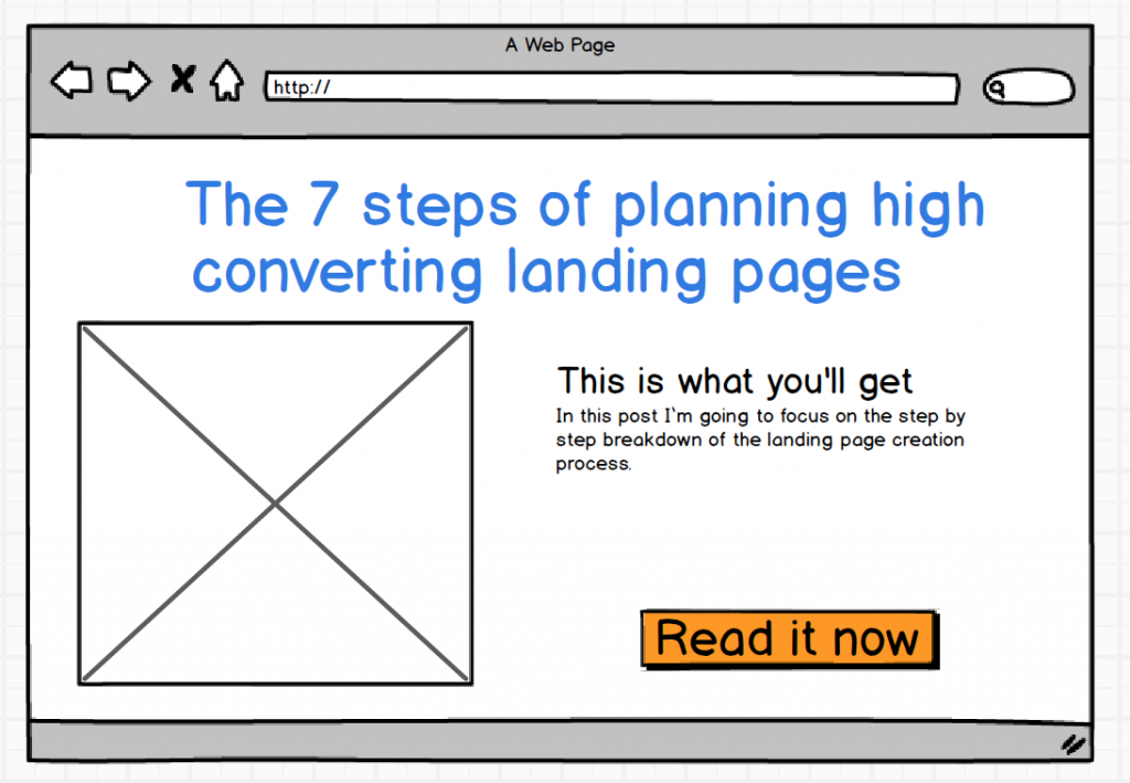
In this post I’m going to focus on the step by step breakdown of the landing page creation process.
From A blank document to a highly converting landing page
1. Research your audience
What is the purpose of a landing page?
In the bottom line, for your business, a landing page should convert visitors. But getting someone to convert means that you have to walk them though a journey that starts with “seeing” your product for the first time and ends with really “getting it”. Only after they get it – they will convert.
So the landing page is really about understanding how to communicate with your potential client. What you can do, how you can help them, what problem are you solving for them and why you are the perfect solution for them.
This means that every element of your landing page needs to aim to move your visitor one step further in understanding your value for them.
The best way to understand how to show value to someone is by getting to know them, their needs and how they feel about the problem your product is aiming to solve. Every element in your landing page should act as an answer to a potential user’s question which has landed on your site.
Think about what is the kind of headline that will make them understand they got to the right place? What they were looking for to being with? What would a potential client ask you? What would they need to know to be convinced that you are the right product for them?
How can you answer these questions? By simply talking to your target audience.
Do the interviews where it’s comfortable
What should you look for when conducting an interview?
- How you present your idea – Similar to crafting your elevator pitch, you should notice the way you present your idea and how your potential user reacted to it? Did they reflect your product using different words? Did they care?
- What were their questions – If you’re having a conversation (which you should be having) it means you said some stuff, they responded and probably asked you some following up question. Each question they ask is a question a visitor on your landing page might ask himself to fully understand your value. Unlike your conversation partner, you won’t be there to answer your landing page visitor and will probably lose the potential user over it. A successful landing page is one that can predict every question or misunderstanding users might have.
- What is the order of the questions they asked? A good landing page must have a specific content hierarchy. Understanding which questions follows which feature or aspect of your product is a great way to understand your story flow for you landing page.
- Spot the A-ha moment – What was their ‘a-ha’ moment regarding your idea. When you told them about your product, at what point did they have the “I got it!” spark. When did they get excited about your solution? Was it a certain feature? Design related? Write it down.
Besides understanding what your potential users want from you, it’s important to understand your audience and get the psychology behind their actions. Neil Patel wrote an amazing guide on ‘Understanding Consumer Psychology’ that will get you way ahead of your competitors in terms of understanding your potential users. You should follow this guide when progressing to the next step.
2. Plan your storyline
After talking with your target audience, you can now start applying what you’ve learned and take the first step in creating your landing page story and flow.
I usually use a 3 steps method to create my first draft of the storyline
Step 1: Write it all down
- Make a list of all the things you want to say about your product.
- Make a list of all the questions you were asked in the interviews you’ve conducted (and answer them)
- Make a list of all your features.
Don’t judge your list, just write everything down. The more you’ll have written down ahead of the next step, the more productive, creative and accurate you’ll be.
Step 2: Converge and Prioritize
- Converge: – Some of the things you want to say about your product are already mentioned in the questions your users asked. Some of the things your users asked are probably listed in the existing features and so on. You get where I’m going with this.The idea behind this step is to eliminate repetition and ease some of the load that will result from combining the 3 lists together.After this step you’re supposed to have only one copy of each item on your list. So if your customers told you security is important to them and you already had it on your list of things you want to say about your product, you’re supposed to have only one item regarding security.
- Prioritize – Not all messages and features were created equal and there is a simple way to decide who the rulers and losers of the messaging chain are (messaging chain, food chain. see what I did there?): What is important to your user?
Prioritize the items you’re left with after merging the lists together using these 2 factors:
- What is the best order of items for telling your products story
- What did your potential users ask about / were concerned about the most.
At the end of this step you’re supposed to have an organized list that is the baseline of your storyline.
It should look something like this:
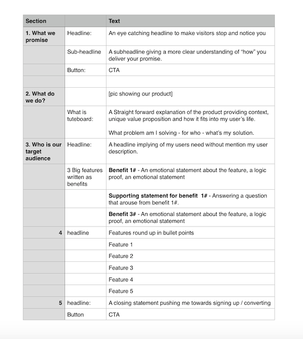
3. Build the structure for you messaging – tell your story.
You’ll notice that in the diagram above I left the design out totally.
The reason I left it out is that I want to fully focus on my story. I still don’t want to think about what elements I’m going to use or how they will look like. First, I want to make sure i have the right story flow and only than think about how am I going to present them.
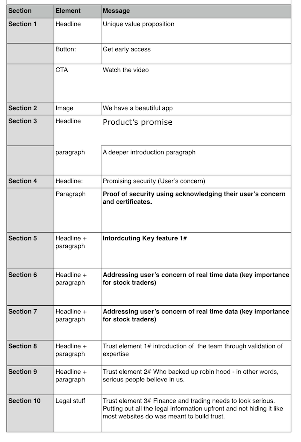
For example, let’s take a look at Robin Hood, one of the best landing pages I’ve seen lately (with over 400,000 people waiting in line to sign up). Click here to see their landing page.
Here’s how I would describe it on the same diagram I showed about:
4. Plan wireframes and direct content
After you got the messaging flow right, you can start planning on “how” you are going to tell your story by working on a wireframe.
This is the point where you start deciding how you are going to convey each message – by text, image, or video.
If you’ll go to the Asana home page, you’ll notice that they keep things very simple by following a simple flow of:
- What is asana – headline and sub headline
- Why you should trust us – logos of companies using Asana
- What Asana is for – A simple line + learn more link (the heavy lifting is in that ‘learn more’ page).
- Is Asana right for my project? – Again, simple line + learn more link. (Same target page)
- What features does Asana have? Video, not text.
Notice how each segment could have been easily translated to another format? They could have showed off their features with text on their landing page and not video (They do that in the “learn more” section). But by understanding their story first they were able to find the best way to tell their story and not just integrate a video for the sake of integrating a video.
Let’s take another example – let’s say I’m selling a finance product and I need to show you how secure my product is. I can either write a long paragraph saying how we use the strictest security measures and write a lot of complicated terms or simply put big logos of all the security badges and certifications I have for my site.
The wireframe stage is usually when you translate what you want to say into how you want to say it. It usually ends up looking something like this:

One of the best things about sorting your story into a wireframe, even if it’s not the one who will actually end up designing it, is that flaws are much more visible. It’s a great way to get a better feel of what you’re creating and if you’re capturing the experience or not.
I’m a big fan of Blasamiq for wire framing, but if you want to explore other apps for wire framing, you can see Mashable’s top 20 lists here
5. Audit your story
Remember that it all comes down to how your users react to your page? The wireframe stage is a good timing for testing if you’re messaging and structure are the right ones.
Simply send your wireframe to 10 different potential users, and see if they “get” what you’re offering. If the story is clear enough.
See if they still have unanswered questions, or concerns you haven’t approached on your page.
When getting feedback on your wireframe, try to also understand if beside from providing them with all the information they needed, did you provide all the information at the right order.
Let’s take a friction a finance product might have – If my users are worried about security and I’m only addressing their concern at the end of the landing page, they might wonder off looking for an answer to their security concerns and won’t follow the flow you’ve designed. If you’d introduce the security features at the right time, they would follow your flow and gain more trust because they will feel that you know what’s important to them.
See if the story you’re telling, and the order of events you’re telling it in strikes a chord with your target audience. If you’re still not there, go back to step 3. In the last two projects I worked with we had to go back and rethink the story for 4 times.
6. Add viral hooks
Getting visitors for your landing page isn’t always easy. After I make sure I got the story right, I always spend some time thinking if there is any way I can add some kind of sharing / social element to the landing page.
It can go from building in an incentive such as “share to get early access” for apps with waiting lists to simply adding a sentence saying “Do you think your Twitter followers will love our product? If so, please share us our product on Twitter”.
I would usually never push the share so much before sign up, but it can do some good and doesn’t hurt the conversation rate from what I’ve witnessed, but it does improve share rates, which is crucial for your product at this stage.
7.Finalize copywriting and design.
It’s time to finalize your copywriting, clean and brush every line, paragraph and exclamation point. Re-edit your text, make sure it looks and sounds great. Sharpen everything you can and you’re ready to go.
You’ll notice I didn’t talk much about the actual design at all (wire framing an design are cousins, but not the same thing.) There are tons of resources on what makes a great landing page design, how to choose the right colors and fonts etc. But I will leave that to another post. Here, I simply wanted to show the process of getting to that baseline.
Bonus tip:Document for A/B testing
When planning your landing page you will have a lot of discussions, second guessing and concerns about what is good enough, what might be better or more accurate messaging or copywriting. While creating the landing page, document all your concerns and potential friction points and use them later as a starting point for the A/B testing you’ll do to optimize conversions.
Creating a highly converting landing page is a work that’s never done. There are always new tweaks you can try to improve conversion rates, still, they all follow the same guideline – know your audience and deliver your story in a way they will understand and get excited about your product. It starts and ends with that.
What is your process when designing a landing page? What is your step one?
Are you on Twitter?
How to plan a high converting landing page by @roypovar (Tweet This)
Plan a high converting landing page in 7 steps (Tweet This)
The 7 steps of planning high converting landing pages (Tweet This)